
[PORTUGUÊS]
Não foi uma surpresa ver designers de moda encontrando suas inspirações em trabalhos de pintores, escultores, designers têxteis, o que surpreendeu foi o vermelho sangue dos animais mortos para fazer as peles… Ops, não era bem isso que eu queria falar. Vou tentar novamente.
Não foi uma surpresa ver designers de moda encontrando suas inspirações em trabalhos de pintores, escultores, designers têxteis, o que surpreendeu foi a grande incidência de roupas com estampas inspiradas em obras de arte.
Impressionismo francês, Liberty anglo-italiano, Art Déco, Jugendstil (= Art Nouveau), expressionismo abstrato de Jackson Pollock e Secessão Vienense de Gustav Klimt. Isso só na casa Angelo Marani!
Agora, imaginem vocês que a costura foi incluída na categoria de ofícios, quando houve a separação das artes e ofícios no século XVIII. Desde então, os costureiros, os estilistas, os designers vem tentando aproximar estes dois campos. Nesta edição da semana de moda italiana, trouxeram para a passarela inclusive os artistas que se voltaram para a moda como: Klimt que sugeria roupas com enfoque estético nas estampas e na sua estrutura; e Giacomo Balla que fez com que o movimento futurista atingisse o campo da Moda, ao propor roupas assimétricas, confortáveis e com cores, formas, padrões e tecidos criados por ele.
Será a feira de arte contemporânea – Affordable Art Fair – em Milão ou uma necessidade da moda estreitar seu relacionamento com a arte para ser considerada como tal, o fato é que nos faz continuar indagando: moda é arte? Enfim, divirtam-se com as tags nos links e aproveitem o show!
[ENGLISH]
It wasn’t a surprise to see fashion designers finding their inspiration in artworks of painters, sculptors, textile designers, what surprised me was the red blood of the dead animals to make fur clothes… Oops, that wasn’t what I wanted to speak about. I’ll try again.
It wasn’t a surprise to see fashion designers finding their inspiration in artworks of painters, sculptors, textile designers, what surprised was the high incidence of clothes with prints inspired by artworks.
French Impressionism, Anglo-Italian Liberty, Art Deco, Jugendstil (= Art Nouveau), abstract expressionism of Jackson Pollock and Vienna Secession of Gustav Klimt. This just in Angelo Marani maison!
Now, just imagine that the sewing was included in the category of crafts, when there was a separation between arts and crafts in the eighteenth century. Since then, dressmakers, stylists, designers have been trying to approximate these two fields. In this edition of the italian fashion week, they also brought to the runway the artists who turned to fashion as: Klimt, who suggested clothing focused on the aesthetic of the prints and the structure; and Giacomo Balla, who did the futurist movement to reach the fashion’s field by proposing asymmetrical and comfortable clothes with colors, shapes, patterns and fabrics created by him.
It can be the contemporary art fair – Affordable Art Fair – in Milan or the need to strengthen the relationship between fashion and art, the fact is that makes us keep questioning: Is Fashion Art? Well, have fun with the tags on the links and enjoy the show!
Antonio Marras & El Lissitzky / Ennio Morlotti


[POR] Após o tigre de Kenzo, a face de um animal na frente de um suéter parece ter perdido a graça, certo? Não na passarela italiana, onde muitas faces de animais puderam ser vistos em estampas. Antonio Marras trouxe o lobo, de forma espelhada, acompanhado por adornos ou simplesmente com a face estampada. Mas não foi só o que chamou a atenção.
- Na primeira imagem, as figuras geométricas na roupa lembram Composition Proun GBA 4, c. 1923 do pintor suprematista e, dentre outras coisas, arquiteto – El Lissitzky, o qual criou a instalação Proun Room, 1923. Acredito que também poderia ser mencionada aqui a obra do mentor de Lissitzky, Kazimir Malevich, Suprematism (Supremus No. 58), 1916 e a obra de László Moholy-Nagy, Composition from Masters’ Portfolio of the Staatliches Bauhaus (Meistermappe des Staalichen Bauhauses), 1923.
- Na segunda imagem, se pensarmos que A. Marras concretizou aquilo que Ennio Morlotti, em Fiori, 1956, pintou abstratamente, ai sim, podemos perceber uma correlação.
[ING] After the Kenzo’s tiger, the face of an animal in front of a sweater seems to be not a big deal anymore, right? Not in the italian catwalk, where many animal faces could be seen in prints. Antonio Marras brought the wolf, in mirrored form, adorned or simply with the face printed. But this was not what called attention.
- In the first image, the geometric forms in the outfit remember those in Composition Proun GBA 4, c. 1923 by the suprematist painter and, among other things, architect – El Lissitzky, who also created Proun Room, 1923. I think it could also be mentioned here the artwork created by the Lissitzky’s mentor, Kazimir Malevich, Suprematism (Supremus No. 58), 1916 and the artwork created by László Moholy-Nagy, Composition from Masters’ Portfolio of the Staatliches Bauhaus (Meistermappe des Staalichen Bauhauses), 1923.
- In the second image, if we think A. Marras materialized what Ennio Morlotti, in Fiori, 1956, abstractly painted, oh yes, we can wonder the correlation.
Bottega Veneta & Alberto Moretti / Vladimir Lebedev

 [POR] Blocos de cores formando desenhos geométricos (e criando um bonito efeito nas saias com pregas e não só). É o que pode ser visto na coleção de Bottega Veneta. Com o desejo de levar energia e segurança para as mulheres, a maison trouxe o construtivismo para a passarela.
- Como movimento que deu origem ao construtivismo, também pode-se mencionar aqui a influência do abstracionismo geométrico de Alberto Moretti – o pintor – não só na estampa do casaco como também em dois vestidos mais, sendo que em um deles tem como base as cores preta e verde.
- Duas cores diferentes de couro foram recortadas em formas geométricas irregulares e costuradas no vestido preto de comprimento médio, criando assim um efeito similar ao das cores e formas integradas da obra de Vladimir Lebedev, Relief, 1920. Eis o construtivismo russo.
[ING] Color blocks creating some geometric designs (and beautiful effects in the pleated skirts and not only). It’s what we can see in the Bottega Veneta’s collection. With the desire to bring energy and security for the women, the maison brought the constructivism art moviment to the catwalk.
- As a movement that gave rise to constructivism, we can also mention here the influence of the geometric abstractionism of Alberto Moretti – the painter – not only in the printed coat as well as two more dresses (one of them is based on the black and green colors).
- Two different colors of leather were cutted in irregular geometric shapes and sewn in the black dress, creating an effect similar to the colors and integrated forms painted by Vladimir Lebedev, in Relief, 1920. Here is the russian constructivism.


[POR] A marca propõe uma mulher com muitas referências, uma mulher que coleciona trajes étnicos e os veste, sortida e inteligentemente. Se o nomadismo e a boemia explicam bem a coleção de Etro, Gustav Klimt também! O alto teor de informação de moda contida em suas obras sempre será fonte para decodificações e interpretações. Nesta coleção, as criações do pintor serviram de base para a riqueza de detalhes dos tecidos nobres.
- Aqui se requer um pouco mais atenção. Repararam no desenho em relevo do vestido (ou seria saia e blusa?) em veludo devorê ? Agora, vejam como se assemelha ao desenho contido no canto superior direito de Friso de Beethoven, 1902. Além disso, o padrão de cores da saia na pintura se repete na estampa do casaco.
- Na segunda, tanto a modelo quando a mulher em Portrait of Friederike Maria Beer, 1916 vestem macacão (ou seria calça e blusa?) com estampas semelhantes, mas com um detalhe: o que eram ondulações na pintura se tornaram estampa paisley na coleção.
[ING] The brand suggests a woman with many references, a woman who collects ethnic costumes and wear them in a mixed and wise way. If nomadism and bohemia explains well the Etro’s collection, it looks like Gustav Klimt too! The high content of fashion information in his artwork will always be a source for decoding and interpretation. In this collection, the paintings inspired the rich detail of the fine fabrics.
- Here, it is required a little more attention. Have you noticed the embossed design of the dress (or should I say skirt and blouse?) in devore velvet? Now, see how it resembles the design contained in the upper-right corner of Beethoven Frieze, 1902. Moreover, the color pattern in the skirt (painting) is similar to the color pattern in the coat’s print (collection).
- On the second image, both the model and the woman in the Portrait of Friederike Maria Beer, 1916 are wearing overalls (or should I say pants and blouse?) with similar patterns, but with a detail: what were curves in the painting became paisley pattern.
Fausto Puglisi & Sonia Delauney / Kasimir Malevich


[POR] Vermelho, laranja, verde, preto, branco, lavanda, muita geometria e pronto! Temos Sonia Delauney e Kazimir Malevich inspirando a coleção de Fausto Puglisi, que trouxe uma boa variedade de saias, incluindo o modelo armado que definitivamente faz parte do DNA da marca. Como se pode ver, a cor e a forma são os elementos para estabelecer uma relação entre as roupas de F. Puglisi e as obras dos artistas. Nem mesmo a escolha dos sapatos foi por acaso: além das cores, a parte frontal de um scarpin sugere uma forma triangular. Mas também podemos citar como outro elemento a disposição das figuras, em se tratando dos losangos na estampa da saia e dos losangos de Projet de tissu n° 1196, 1948 por Sonia Delauney, apesar de não estarem no mesmo ângulo. A pintora, e também designer moderna, poderia ser considerada como epítome de ‘Arte + Moda’, devido ao seu extenso trabalho unindo ambas as áreas. O triângulos coloridos de sua estampa (segunda imagem) já inspiraram outras coleções e agora inspiram os triângulos justapostos da camisa de seda. Na terceira imagem, temos Suprematist Variations and Proportions of Colored, 1919 de Kazimir Malevich. Aqui, não há que se falar em coincidência na disposição das figuras, mas a similaridade das cores e da forma é visível.
(vale a pena conferir o artigo sobre Sonia Delauney no blog de Lilian Pacce)
[ING] Red, orange, green, black, white, lavender, lots of geometry and voilà! We have Sonia Delauney and Kazimir Malevich inspiring the Fausto Puglisi’s collection, that brought a good selection of skirts, including the oversized model which is definitely part of the brand’s DNA. As you can see, color and form are the elements to establish a relationship between the clothing and the artworks of the artists. Not even the choice of the shoes was by chance: besides the colors, the front of the scarpin suggests a triangular form. However, as another element, it can also be cited the provision of the figures, in the case of the diamond-shape in the skirt’s print and the diamond-shape in the Projet de tissu n° 1196, 1948 by Sonia Delauney, although not at the same angle. The painter, and also modern designer, could be regarded as the epitome of ‘Art + Fashion’, due to her extensive work combining both areas. The colored triangles in her textile print (second image) has inspired other collections and now inspire the juxtaposed triangles of the silk shirt. In the third image, we have Suprematist Variations and Proportions of Colored, 1919 by Kazimir Malevich. Here, there isn’t a kind of coincidence of the disposition between geometric figures, but the similarity between colors and forms is visible.
Frankie Morello & Julie Verhoeven

[POR] O mundo delicado e lascivo de Julie Verhoeven também foi explorado por Frankie Morello, cuja coleção brincou com os opostos: girlie/sensual, transparência/opacidade, suavidade/severidade. Não é de hoje que o trabalho da ilustradora de moda está entre os queridinhos de grandes marcas, tais como: Louis Vuitton, Mulberry, Versace, H&M Home, Melissa, M.A.C., dentre outras. Em 2001, ela criou uma série de ilustrações em preto e branco chamada Self Service (há outros trabalhos em preto e branco). Ali, podemos reconhecer alguns desenhos utilizados na estampa dos tecidos em metalassê de Frankie Morello: o olho, o espelho, as árvores, o rosto, as flores…
[ING] The delicate and lustful Julie Verhoeven‘s world was also explored by Frankie Morello, whose collection played with opposites: girlie/sexy, transparency/opacity, smoothness/severity. The work of the fashion illustrator is among the darlings of the big brands such as Louis Vuitton, Mulberry, Versace, H&M Home, Melissa, M.A.C. and others. In 2001, she created an illustration series in black and white called Self Service (there are other works in black and white). Here, we can recognize some designs used in Frankie Morello’s prints: the eye, the mirror, the trees, the face, the flowers…
Gabriele Colangelo & Joachim Bandau


[POR] Aquilo que subitamente se pode atribuir como inspiração para a coleção de Gabriele Colangelo é a série Black Watercolours de Joachim Bandau (1, 2), que reúne duas caracteristicas do pintor e escultor: o minimalismo e o foco na interseção das formas geométricas. As aquarelas em tons de cinzas dos retângulos transparentes foram sobrepostas em um modo que sugere movimento. Colangelo revisitou essas referências e as decodificou em sua coleção em duas formas: em estampa (como podemos ver no vestido da primeira imagem); e em painéis de tecido sobrepostos que vão gradativamente do branco ao preto, passando por escalas de cinza, assim como no outfit da segunda imagem.
[ING] What we can suddenly assign as inspiration for the Gabriele Colangelo’s collection is the Joachim Bandau’s Black Watercolours series (1, 2), which combines two characteristics of the painter and sculptor: minimalism and the focus on the intersection of geometric forms. The watercolors of transparent and overlapping gray rectangles suggest movement. So, Colangelo revisited and decoded these references into his collection in two forms: as pattern, as seen in the dress of the first image; and as overlapping panels ranging gradually from white to black, passing through grayscale, as well as outfit of the second image.

 Nostalgia.
Espaço.
Arte.
Esporte.
Cinética.
Nostalgia.
Espaço.
Arte.
Esporte.
Cinética.
[POR] A coleção de Iceberg trouxe para a passarela a era espacial no final dos anos 60 mixado em seu estilo esportivo. Mas, na verdade, esta viagem futurística para além do vísivel foi comandada pelo considerado pai da arte óptica e cinética, o escultor e artista experimental Yacoov Agam.
- Até agora, uma das mais famosas invenções de Agam é o Agamograph, que implementou a impressão lenticular, um método que incorpora imagens diferentes que podem ser vistos de acordo com o ângulo que o espectador está. Inimate Star é um agamograph e inspirou os enfeites multicoloridos bordados no painel plissado da saia acima.
- Os retângulos de plástico transparente sobrepostos no suéter em tecido neoprene recriam a entrada da instalação Aménagement de l’antichambre des appartements privés du Palais de l’Elysée pour le président Georges Pompidou (Desenvolvimento da antecâmara dos aposentos privados do Palácio Elysée para o presidente Georges Pompidou) criada por Yaacov Agam, 1974 no Centro Georges Pompidou, Paris.
Nostalgia.
Space.
Art.
Sport.
Kinetics.
[ING] The Iceberg’s collection brought to the catwalk the space age in the late 60s mixed in its sporty styling. But in fact, this futuristic journey to the beyond the visible was guided for the master of the optical and kinetic art, the sculptor and experimental artist Yacoov Agam.
- Until now, one of the the most famous creations by Agam is the Agamograph, which implemented lenticular printing, a method which incorporates different images that can be viewed according to the viewer position. The artwork Intimate Star is an agamograph that inspired the multicolored embellishments embroidered on the pleated panel of the skirt above.
- The transparent plastic rectangles overlapped on the neoprene sweater recreate the entry of the installation Aménagement antichambre l’ installation des appartements du privés Palais de l’ Elysée pour le président Georges Pompidou (Development of the antechamber of the private chambers of the Elysée Palace for President Georges Pompidou ) created by Yaacov Agam , 1974 at the Centre Georges Pompidou, Paris.
Jil Sander & o Pontilhismo

[POR] Ainda que sem Jil Sander, a coleção de inverno masculina da marca conseguiu se tornar mais interessante na medida em que usou uma textura com padrão semelhante ao do pontilhismo (pontos de cor pura são aplicados em padrões de modo a formar uma imagem) para conferir um ar despojado à alfaiataria minimalista, que é inerente à maison. Esta mesma textura, criada através de semiesferas em relevo, foi incorporada na coleção feminina, atribuindo criatividade e sensorialismo ao conceito minimalista. Como exemplo da técnica do pontilhismo (também chamado divisionismo), selecionei a obra de George Seurat, Modelo de Costas, 1887.
[ING] Even without Jil Sander, the AW 2014-15 menswear collection was able to become more interesting as they used a texture that resembled to pointillism (dots of pure color are applied in patterns to form an image) to give a fresh air to the minimalist tailoring, that is inherent to the maison. This same texture, created with semi balls in relief, was incorporated in the womenswear collection, attributing creativity and sensorialism to the minimalist concept. As an example of the technique in the Pointillism, I selected the artwork by George Seurat, Model From The Back, 1887.
Marco De Vincenzo & Anni Albers

[POR] Christopher Farr lançou uma exibição chamada Editions: Contemporary Rugs for Collectors, reunindo tapetes com desenhos de artistas conhecidos. Dentre eles, a artista têxtil e gravurista Anni Albers. Muitas vezes, ela começou seus projetos de tecelagem com esboços, em alguns deles explorou a construção horizontal e vertical, utilizando cor, forma, proporção e ritmo como em Study Rug, inicialmente concebido como uma decoração de parede em 1926. A padronagem do agora tapete parece ter sido aproveitada na coleção de Marco De Vicenzo, que trabalha sobretudo com o decorativismo gráfico das linhas, além dos quadrados e circulos, seja em tecidos leves, perfurados ou mais rigorosos. A saia plissada com fundo de textura em furta cor é um exemplo disto.
[ING] Christopher Farr launched an exhibition called Editions: Contemporary Rugs for tracks, gathering designs of well known artists. Among them, there is the textile artist and printmaker Anni Albers. She often began her weaving projects with design sketches, in some of them she explored the theme of horizontal-vertical construction using color, shape, proportion, and rhythm such as in Study Rug, originally conceived as a wall hanging in 1926. The pattern of what is now a rug looks to have inspired the Marco De Vicenzo’s collection, that worked with graphic and material decoration through lines, squares and circles, in a very light and openwork fabric or more rigorous fabric. The pleated skirt with mottled textured background is a good example of this.
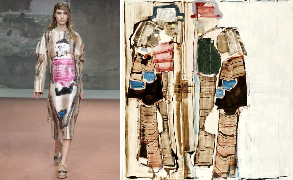
[POR] Eis uma coleção capaz de transformar tendências da moda em algo alternativo, único, arquitetônico. Entre volumes amplos, babados exagerados, jogo de contradições (o que parece firme e denso, na verdade é macio e leve), plumagem e o artesanato intrínseco à marca, a coleção de Marni renova com a arte. É transportada para as estampas das peças simples, como a túnica acima, a técnica do artista contemporâneo Magnus (von) Plessen, conhecido pelo seu figurativismo abstrato, que consiste em adicionar ou remover camadas de tinta para revelar as formas da figura. Obra: Magnus Plessen, Paare, 2006.
[ING] Here is a collection able to transform the fashion trends into something alternative, unique and architectural. Among large volumes, exaggerated ruffles, set of contradictions (what looks like firm and dense, in fact it’s soft and light), plumage and the craftwork intrinsic to the brand, the Marni’s collection renews with the art. It’s transported to the prints of the simple pieces, like the tunic above, the technique of the contemporary artist Magnus (von) Plessen, known for his abstract figurativism, which consists of adding or removing layers of paint to reveal the shapes of a figure. Artwork: Magnus Plessen, Paare, 2006.


[POR] Os tecidos brocados com cores metalizadas em roupas oversized são por si só uma injeção de arte ao tendencismo na coleção de MSGM. Além de Björk, a coleção se inspirou no pintor Gergard Richter, mais especificamente em sua fase overpainting. As estampas sugerem que borrões de tinta foram jogados em cima de um retrato propositalmente, conferindo-lhes uma espécie de abstração misteriosa. Não se trata mais de photoprint, mas de um “photopainting” na estampa. É este o estilo fotografia-pintura de G. Richter, é este o estilo que confere mais arte à coleção. Na primeira foto temos, Piz Rosatsch, 1992; na segunda, temos Firenze, 2000.
[ING] The brocades tissues with metallic colors in oversized clothes are by themselves an injection of art to the “what is trend now” in the MSGM’s collection. Besides Björk, the collection also got inspired by the painter Gergard Richter, more specifically in his overpainting phase. Here, the prints suggest that ink blots were thrown over a picture purposely giving them a kind of mysterious abstraction. It’s not more about photoprint, but a “photopainting” in the prints. This is the photograph-painting style used for G. Richter. This is the style that brings more art to the collection. In the first picture we have, Piz Rosatsch, 1992; in the second, we have Firenze, 2000.


[POR] Com uma atmosfera de Alemanha nos anos 70, a coleção de Prada evoca Rainer Werner Fassbinder e Pina Bausch, para transformar os modelos em personagens intensos que enfrentam seus problemas mais íntimos para encontrarem a si mesmos. Neste contexto, entra um pintor capaz de se olhar frente às coisas do mundo: Giacomo Balla, que também foi convidado por Sergei Diaghilev para se tornar cenógrafo e figurinista. As estampas dos vestidos e dos casacos refletem o estudo de Balla sobre o caráter técnico-científico acerca da decomposição da cor e da luz, sobre a dinâmica do movimento e da velocidade.
- É latente a sugestão de movimento e velocidade na estampa do vestido de seda, assemelhando-se a obra Velocidade de um Automóvel, 1912.
- Tanto na estampa do vestido quando em Studio per Mobile Futurista (mobile smontabile), 1920 foram criados padrões geométricos através da interposição de cores (cores presentes em ambos).
Quanto a nós, espectadores, estamos a espreitar a coleção de Prada como os jornalistas diante de toda a dinâmica do drama vivido e vestido pela protagonista de As Lágrimas Amargas de Petra Von Kant (1972).
[ING] With an atmosphere similar to that in Germany in the 70s, the Prada’s collection evokes Rainer Werner Fassbinder and Pina Bausch, to turn the models into intense characters who face their most intimate problems toward finding themselves. In this context, emerges a painter able to put himself ahead of the things in the world: Giacomo Balla, who was also invited by Sergei Diaghilev to become a set and costume designer. The prints in the dresses and coats reflect his study on the technical-scientific nature concerning the decomposition of color and light and on the dynamics of the movement and of the speed.
- It’s latent the suggestion of movement and velocity in the silk dress’ print, resembling the artwork Velocity Of An Automobile, 1912 by Balla.
- In the print of the dress as much as in the artwork Studio per Mobile Futurista (mobile smontabile), 1920 were created geometric patterns featuring an interposition of colors (colors present in both).
About us, spectators, we are peeking the Prada’s collection as the journalists in front of the whole dynamic of the drama lived and dressed by the protagonist of The Bitter Tears of Petra Von Kant (1972).
Sportmax & Jackson Pollock


[POR] Sportmax resolveu fazer um novo experimento. Se na coleção passada a maison trabalhou com as formas geométricas, desta vez resolveu se liberar de restrições, incorporando um desejo de extravagância ao DNA simplificado. E isso foi encontrado no expressionismo abstrato através do qual, o artista recusa qualquer forma de realismo, de pintura figurativa para explorar a forma abstrata. Dentre todos os artistas, a maison olha especificamente para um dos Irascíveis: Jackson Pollock e seu o dripping fortemente gestual. Ele não pintava lançando a cor sobre a tela em posição normal, em cima de um cavalete, mas deitando grandes rolos no chão e gotejando a tinta em cima. Esse sistema de trabalho se chama dripping e é isso que podemos ver em variados modos nas estampas das roupas com efeito de gotejamento e rabiscos:
- Convergence, 1952.
- Unknown.
- Segundo informações, a pintura nesta última imagem é inspirada em Pollock, feita por outro pintor. De qualquer forma, guarda particular semelhança com a saia em organza.
[ING] Sportmax decided to make a new experiment. If in the last collection, the brand came with geometric shapes, this time decided to break free of restrictions, incorporating a desire for extravagance in its minimalism. And that was found in the abstract expressionism through which the artist refuses any form of realism – figurative painting – to explore the abstract form. Among all the artists, the maison looks at one of The Irascibles: Pollock and his strongly gestural dripping. He didn’t use to paint throwing the color on the canvas in a normal position, on top of a trestle, but laying large rolls on the floor and dripping the paint onto it. This working system is called dripping and that’s what we can see in various ways in the prints of the clothes with drip effect and scribbles.
- Convergence, 1952.
- Unknown.
- According to some informations, the painting in the last image is a Pollock-inspired painting. Anyway, it has similar characteristics with the skirt in organza.
_________
[POR] É, no mínimo, curioso perceber o quanto a Arte aplicada a qualquer campo nos inspira. Para todos os amantes da arte de todo mundo, um dia ricamente produtivo e feliz!
[ING] It’s, at least, curious to see how much the Art applied to any field inspires us. For all art lovers around the world, a richly productive and happy day!
Inté,
Cri.
29.501182
-98.632509


 [PORTUGUÊS]


 [PORTUGUÊS]


